PERSONAL PROJECTS
Personal Projects
Independent projects exploring packaging, product design, branding, and visual ideas beyond the commercial brief.
View Project →
CLIENT
CLIENT
Columna Branding
Columna Branding
Columna Branding
ROLE
ROLE
Junior Graphic Designer
Junior Graphic Designer
Junior Graphic Designer
DURATION
DURATION
Two years
Two years
Two years
INDUSTRY
INDUSTRY
Branding & Packaging
Branding & Packaging
Branding & Packaging
Brand Development
Brand Development
Brand Development
Packaging Design
Packaging Design
Packaging Design
Photography Direction
Image Retouching
Image Retouching
Image Retouching
Print Design
Print Design
Print Design
Campaign Developmnet
Campaign Developmnet
Campaign Developmnet
01 /
LA Española
01 /
LA Española


La Española involved developing new variations from an established product range, exploring different colours, patterns, flavours, and formats while staying connected to the existing brand. I worked through different visual directions using photography, Photoshop mockups, colour exploration, and compositing to see how each idea could translate into the final packaging.
La Española involved developing new variations from an established product range, exploring different colours, patterns, flavours, and formats while staying connected to the existing brand. I worked through different visual directions using photography, Photoshop mockups, colour exploration, and compositing to see how each idea could translate into the final packaging.
La Española involved developing new variations from an established product range, exploring different colours, patterns, flavours, and formats while staying connected to the existing brand. I worked through different visual directions using photography, Photoshop mockups, colour exploration, and compositing to see how each idea could translate into the final packaging.


02 /
LA MENORQUINA
02 /
LA MENORQUINA


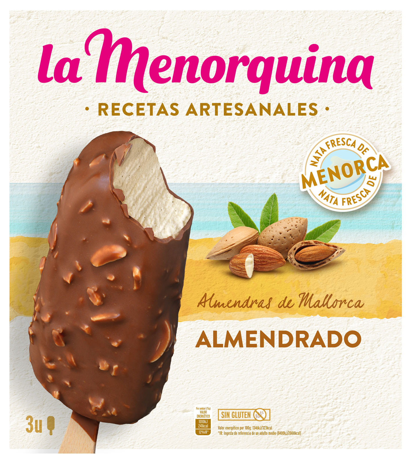
For La Menorquina, I developed packaging variations across different ice cream flavours and products, exploring how colour, imagery, and composition could differentiate each variety while keeping the range recognisable as part of the same brand. The process involved developing and adapting multiple concepts across the different products.
For La Menorquina, I developed packaging variations across different ice cream flavours and products, exploring how colour, imagery, and composition could differentiate each variety while keeping the range recognisable as part of the same brand. The process involved developing and adapting multiple concepts across the different products.


03 /
EL CASERIO
03 /
EL CASERIO


For El Caserío, I adapted the existing packaging approach across different products, exploring variations in product placement, imagery, and layout. The challenge was to give each product its own identity while keeping the range visually connected and easy to recognise.
For El Caserío, I adapted the existing packaging approach across different products, exploring variations in product placement, imagery, and layout. The challenge was to give each product its own identity while keeping the range visually connected and easy to recognise.


04 /
De la viuda
04 /
De la viuda


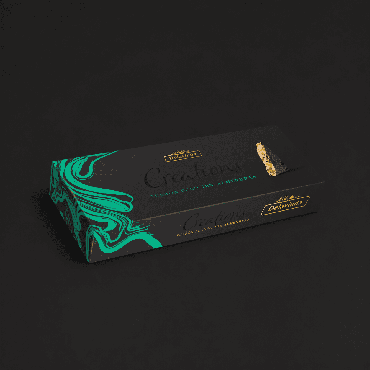
For De La Viuda, I developed a special holiday packaging concept designed around a more distinctive seasonal expression of the brand. The concept was adapted across different product variations, creating a limited-edition treatment while retaining the recognisable character of the original packaging.
For De La Viuda, I developed a special holiday packaging concept designed around a more distinctive seasonal expression of the brand. The concept was adapted across different product variations, creating a limited-edition treatment while retaining the recognisable character of the original packaging.


05 /
OTHER BRANDS
05 /
OTHER BRANDS


The remaining work includes projects for Obach, Bref, Sanytol, and Dodot, each presenting a different design challenge. From exploring variations for Obach's 100-year anniversary and developing concepts for Bref and Sanytol to evaluating how Dodot products would appear in supermarket environments, the work extended beyond packaging into visual exploration and retail application.
The remaining work includes projects for Obach, Bref, Sanytol, and Dodot, each presenting a different design challenge. From exploring variations for Obach's 100-year anniversary and developing concepts for Bref and Sanytol to evaluating how Dodot products would appear in supermarket environments, the work extended beyond packaging into visual exploration and retail application.


Selected work